Top CSS Battle solutions, part II
This is the continuation of the blog post: Top CSS Battle solutions.
I deconstruct top CSS Battle solutions to see how they work and to teach myself.
07 January 2026
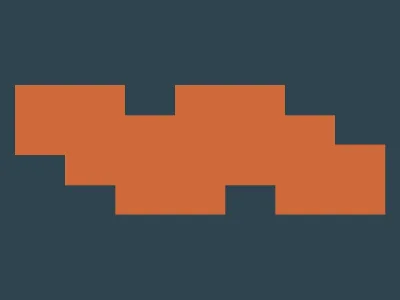
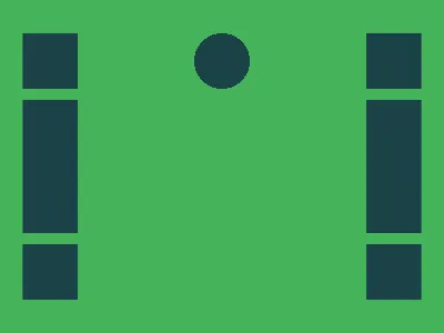
The top solution is by Vegy.
It reads like this:
<style>*{background:#2F434E;color:#CF6939;box-shadow:5vh 90q,65px 122q,122q 153q;width:110;height:70;*{margin:0 160It is equivalent to this CSS:
html,body { background: #2f434e; color: #cf6939; box-shadow: 5vh 90Q, 65px 122Q, 122Q 153Q; width: 110; height: 70; /* border: 1px solid red; */}body { margin: 0 160;}It uses two already existing elements: html and body.
The first thing is that the html element, while being a normal element, has something special to it: its background color spans the whole document, unlike any other element.
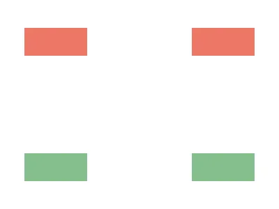
The elements themselves are not visible, but there are three box-shadows that are visible and form the needed shape. If box-shadow does not specify a color, the color property of the element itself is used.
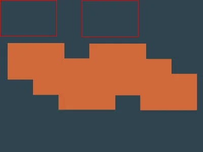
I added a red border to the elements so that we can see where they are themselves:
08 January 2026
The top solution is by H_Bliertz. The code is as follows:
<style>*{*{background:#DC26;--b:38%5ch/11q}margin:40 35;border-image:linear-gradient(#E76,50%,#84BE8D 0)50%/var(--b,5ch 5lhThis code only uses the html and body elements and can be rewritten as this for better understanding:
* { * { background: #dc26; --b: 38% 5ch / 11Q; } margin: 40 35; border-image: linear-gradient(#e76, 50%, #84be8d 0) 50% / var(--b, 5ch 5lh);}It uses nesting and var() with a default parameter to avoid duplication. We can rewrite it like this:
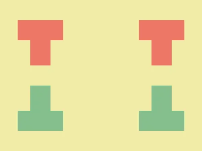
html { margin: 40 35; border-image: linear-gradient(#e76, 50%, #84be8d 0) 50% / 5ch 5lh;}body { margin: 40 35; background: #dc26; border-image: linear-gradient(#e76, 50%, #84be8d 0) 50% / 38% 5ch / 11Q;}The main thing here is the usage of linear-gradient as the value for border-image.
The linear gradient itself looks like this:
html { background: linear-gradient(#e76, 50%, #84be8d 0);}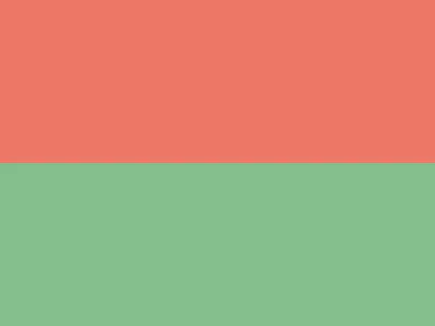
Let’s rewrite the border-image properties without shorthands to see what is going on:
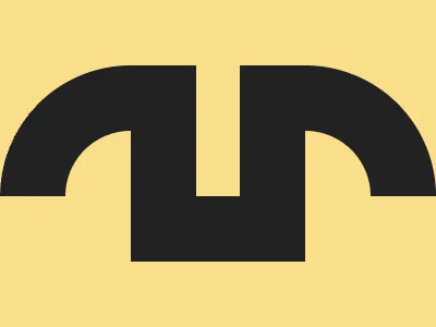
html { margin: 40 35; border-image-source: linear-gradient(#e76, 50%, #84be8d 0); border-image-width: 5ch 5lh; border-image-slice: 50%; border-image-outset: 0; /* default value */ border-image-repeat: stretch; /* default value */}body { margin: 40 35; background: #dc26; border-image-source: linear-gradient(#e76, 50%, #84be8d 0); border-image-width: 38% 5ch; border-image-slice: 50%; border-image-outset: 11Q; border-image-repeat: stretch; /* default value */}For the html element alone, this renders the following image:
The border-image property sets the image to be drawn on the border.
border-image-width is just the same as border-width but used together with border-image.
border-image-slice is about how the image is sliced into nine parts:
border-image-slice: top left right bottom
       |<-- left  -->|        |<-- right  -->|   \/--+-------------+--------+--------------+   top |   Top-left  |   Top  |   Top-right  |   /\--+-------------+--------+--------------+       |     Left    | Center |    Right     |   \/--+-------------+--------+--------------+bottom | Bottom-left | Bottom | Bottom-right |   /\--+-------------+--------+--------------+
In our example, all four values (left, right, top, and bottom) for the border-image-slice are set to 50%. This means that the center collapses and the corners take the whole image. In this case, only the corners are drawn. This behavior is defined in the specification as follows:
The regions given by the border-image-slice values may overlap. However if the sum of the right and left widths is equal to or greater than the width of the image, the images for the top and bottom edge and the middle part are empty—which has the same effect as if a nonempty transparent image had been specified for those parts. Analogously for the top and bottom values.
For the body element, we additionally specify border-image-outset, which controls the distance of the border image from the element. Basically, it works just the same as increasing the size of the element itself.
All together, this renders the desired image.
09 January 2026
This top solution was submitted by Mohamed Ali. Here is the code:
<style>&{scale:52 5}*{border:6Q solid#2b2a4a;margin:2-41 257 427;*{background:#7312;margin:46 4-99-13One thing that interested me here is using & as a selector. It is called the nesting selector and normally is only used inside another CSS rule, like this:
.parent-rule {  &:hover {    /* some rules */  }}
/* equivalent code */.parent-rule:hover {  /* some rules */}
But here it is used at the root level, which is unusual. This is what I found on MDN:
If not used in nested style rule, the & nesting selector represents the scoping root.
In the end, & in this context just refers to the html element.
After rewriting the code in a more readable manner, it looks like this:
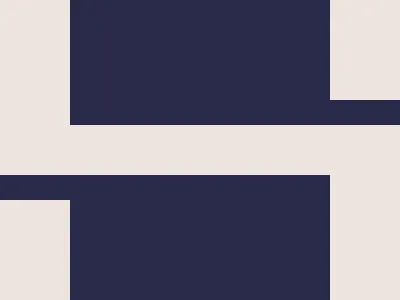
html,body { border: 6Q solid #2b2a4a;}html { scale: 52 5; margin: 2 -41 257 427;}body { background: #7312; margin: 46 4 -99 -13;}The author defines a border for both html and body elements, positions them using the margin property, and finally applies the scale property to the html element.
Both elements look the same:

10 January 2026

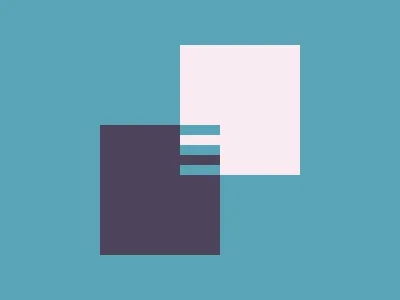
The top solution this day was by H_Bliertz:
<style>*{box-shadow:0 0 0 30vw#E25C57;rotate:45deg;background:#F4DA64;margin:120;scale:.5}&{margin:30 80;border-image:radial-gradient(#E25C57,58q,#F4DA64 0)476/277q/9lhThis solution again only uses the html and body elements, and this time I am highly impressed by this fact. For reference, my own solution used 10 elements.
This solution uses radial-gradient() for the border-image. Here, radial-gradient() creates an image that looks like this:
body { background-image: radial-gradient(#e25c57, 58Q, #f4da64 0); background-position: center; background-size: 200px 200px; background-repeat: no-repeat;}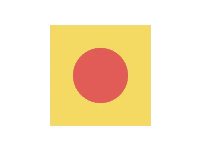
This picture is used as a border-image in such a way that it is only used for corner squares, while all other parts of the border image are not drawn at all. Very similar to what we have seen earlier in this post.
Here is a clearer demonstration of what was done:
<div></div><style> div { background: red; margin: 50 auto; width: 200; height: 200; border-image-source: radial-gradient(#e25c57, 58Q, #f4da64 0); border-image-slice: 100%; border-image-width: 100px; border-image-outset: 30px; }</style>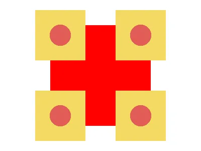
Now, let’s add the box-shadow and adjust the sizes:
<div></div><style> div { background: red; margin: 110 auto; width: 80; height: 80; border-image-source: radial-gradient(#e25c57, 58Q, #f4da64 0); border-image-slice: 100%; border-image-width: 100px; border-image-outset: 79px; box-shadow: 0 0 0 80px green; }</style>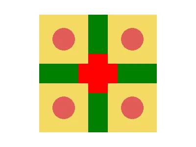
After adjusting the colors and rotating, it looks somewhat similar to the original image:
<div></div><style> div { /* background: red; */ margin: 110 auto; width: 80; height: 80; border-image-source: radial-gradient(#e25c57, 58Q, #f4da64 0); border-image-slice: 100%; border-image-width: 100px; border-image-outset: 80px; box-shadow: 0 0 0 79px #e25c57; rotate: 45deg; } * { background: #f4da64; }</style>
As mentioned earlier, the actual solution uses only the html and body elements. The html element is visually very close to the final image, and body is used as the central part.
The deciphered code for the solution looks like this:
html,body { box-shadow: 0 0 0 30vw #e25c57; rotate: 45deg; background: #f4da64; margin: 120; scale: 0.5;}html { margin: 30 80; border-image: radial-gradient(#e25c57, 58Q, #f4da64 0) 476 / 277Q / 9lh;}
11 January 2026
This top solution was submitted by Mohamed Ali. Here is the code:
<style>*{background:#5aa4b7;margin:125 180;box-shadow:-5ch 5ch 0 5ch#4c455b,5ch -5ch 0 5ch#f9eaf1;*{margin:20 0;font:2px"Again, no additional elements are added. The more readable version of the CSS code looks like this:
html,body { background: #5aa4b7; margin: 125 180; box-shadow: -5ch 5ch 0 5ch #4c455b, 5ch -5ch 0 5ch #f9eaf1;}body { margin: 20 0; font: 2px "";}The html alone is just a small rectangle with two shadows:
html { background: #5aa4b7; margin: 125 180; box-shadow: -5ch 5ch 0 5ch#4c455b, 5ch -5ch 0 5ch#f9eaf1;}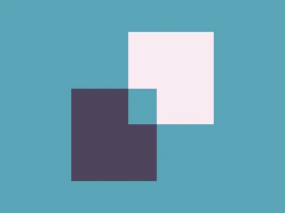
The sizes for the shadows are specified using the ch unit. This allows their size to be controlled by changing the font size.
The body alone looks like this:
html,body { background: #5aa4b7; margin: 125 180;}body { margin: 20 0; font: 2px ""; box-shadow: -5ch 5ch 0 5ch#4c455b, 5ch -5ch 0 5ch#f9eaf1;}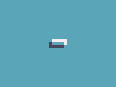
We can combine them and change the colors so that we can see what is what:
html,body { background: black; margin: 125 180; box-shadow: -5ch 5ch 0 5ch green, 5ch -5ch 0 5ch darkgreen;}body { background: white; margin: 20 0; font: 2px ""; box-shadow: -5ch 5ch 0 5ch red, 5ch -5ch 0 5ch darkred;}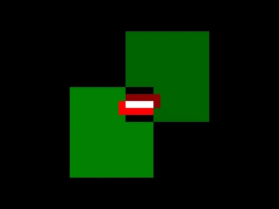
12 January 2026
On this day, the top solution was by Veit Lehmann:
<style>*{margin:-60 60;height:120;border:60px solid#222;border-top:0;background:#FADE8B}&{margin:60 0;border-radius:150px 150px 0 0;border:60px solid#222;border-bottom:0;height:60The html element alone:
html { background: #fade8b; margin: 60 0; border-radius: 150px 150px 0 0; border: 60px solid #222; border-bottom: 0; height: 60;}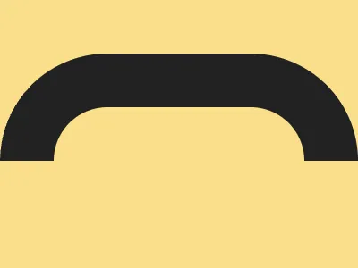
And over it is the body. I made it red here to make it stand out:
html,body { margin: -60 60; height: 120; border: 60px solid red; border-top: 0; background: #fade8b;}html { margin: 60 0; border-radius: 150px 150px 0 0; border: 60px solid #222; border-bottom: 0; height: 60;}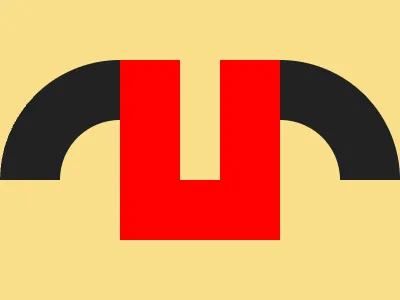
13 January 2026
This day’s top solution was submitted by Mohamed Ali. Here is the code:
<style>&{background:radial-gradient(1Q,#194247,25px,#45b45b)0-95px;*{border:64Q dashed#194247;margin:-40 10;clip-path:inset(74Q 11qThe html element uses radial-gradient for the background:
html { background: radial-gradient(1Q, #194247, 25px, #45b45b) 0 -95px;}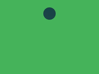
The body element uses a dashed border:
html { background: radial-gradient(1Q, #194247, 25px, #45b45b) 0-95px;}body { border: 64Q dashed #194247; margin: -40 10;}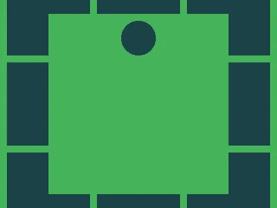
Finally, the body element is clipped using the clip-path property:
html { background: radial-gradient(1Q, #194247, 25px, #45b45b) 0-95px;}body { border: 64Q dashed #194247; margin: -40 10; clip-path: inset(74Q 11Q);}
14 January 2026
This day’s top solution was submitted by Mohamed Ali. Here is the code:
<style>*{background:radial-gradient(6vh 1lh,#0000.006lh,#ffd0fa 0 3.1ch,#a82973)50vw 50vh/243Q 201Q;*{margin:90 0;font:37.5Q/24"It can be rewritten like this:
html,body {  background-image: radial-gradient(    ellipse 6vh 1lh,    #0000 0.006lh,    #ffd0fa 0 3.1ch,    #a82973  );  background-position-x: 50vw;  background-position-y: 50vh;  background-size: 243Q 201Q;}
body {  margin: 90 0;  font-size: 37.5Q;  line-height: 24;}
Both body and html use a radial gradient for the background, but its parameters are set using lh and ch units, so the final shape can be affected by the font-size and line-height properties.
Let’s note that:
- The
lhunit value is thefont-sizemultiplied byline-height - The
Qunit value is 1/40th of a centimeter - 1cm is approximately 37.8px
chis the width of the0character- With the default font size, 1ch is equal to 8px
- When the font size is set to 37.5Q, 1ch is equal to 18px
Let’s first convert the values for the html element. It is exactly what we expect from the radial-gradient. The first color stop in the gradient was so small that I simply removed it.
html { background-image: radial-gradient(ellipse 18px 18px, #ffd0fa 0 25px, #a82973); background-position-x: 200px; background-position-y: 150px; background-size: 230px 190px;}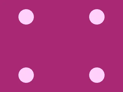
The body element is more tricky. We can see that it actually uses a very tall ellipse.
html { background: black;}body { margin: 90 0; background-image: radial-gradient( ellipse 18px 850px, #0000 5px, #ffd0fa 0 55px, #a82973 ); background-position-x: 200px; background-position-y: 150px; background-size: 230px 190px;}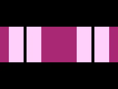
We can make it a bit less tall to better see what is going on:
html { background: black;}body { margin: 90 0; background-image: radial-gradient( ellipse 18px 100px, #0000 5px, #ffd0fa 0 55px, #a82973 ); background-position-x: 200px; background-position-y: 150px; background-size: 230px 190px;}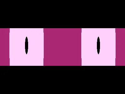
When we combine both, we get the final image:
html {  background-image: radial-gradient(ellipse 18px 18px, #ffd0fa 0 25px, #a82973);  background-position-x: 200px;  background-position-y: 150px;  background-size: 230px 190px;}
body {  margin: 90 0;  background-image: radial-gradient(    ellipse 18px 850px,    #0000 5px,    #ffd0fa 0 55px,    #a82973  );  background-position-x: 200px;  background-position-y: 150px;  background-size: 230px 190px;}
Final words
I enjoyed looking into these clever solutions, and I definitely learned something new from this.
Discussion
Join the discussion on Reddit.